Modals
With modals you can create pop-up forms that allow users to provide you with formatted inputs through submissions. We'll cover how to create, show, and receive modals using discord.js!
This page is a follow-up to the interactions (slash commands) page. Please carefully read that section first, so that you can understand the methods used in this section.
Building and responding with modals
Unlike message components, modals aren't strictly components themselves. They're a callback structure used to respond to interactions.
You can have a maximum of five Label or Text Display components per modal. Similarly a Label may only contain
one component.
To create a modal you construct a new ModalBuilder. You can then use the setters to add the custom id and title.
const { Events, ModalBuilder } = require('discord.js');

client.on(Events.InteractionCreate, async (interaction) => {
	if (!interaction.isChatInputCommand()) return;
	if (interaction.commandName === 'ping') {
		const modal = new ModalBuilder().setCustomId('myModal').setTitle('My Modal');

		// TODO: Add components to modal...
	}
});
The customId is a developer-defined string of up to 100 characters. Use this field to uniquely identify of an
incoming interactions from your modals.
The next step is to add components to the modalBuilder.
Label
Label components are used to add a label and description to interactive modal components.(text input, select menus, etc.)
const { LabelBuilder, ModalBuilder } = require('discord.js');

client.on(Events.InteractionCreate, async (interaction) => {
	if (!interaction.isChatInputCommand()) return;
	if (interaction.commandName === 'ping') {
		// Create the modal
		const modal = new ModalBuilder().setCustomId('myModal').setTitle('My Modal');

		// TODO: Add more interactive components...

		const hobbiesLabel = new LabelBuilder()
			// The Label is large text identifying the interactive component to the user
			.setLabel("What's some of your favorite hobbies?")
			// The description is optional small text under the label and above the interactive component
			.setDescription('Activities you like to participate in');

		// TODO: Add more components...

		// Add label to the modal
		modal.addLabelComponents(hobbiesLabel);

		// TODO: Respond with modal...
	}
});
label can be a max length of 45 characters
description can be a max length of 100 characters
Text Input
Text input is an interactive component used to accept free-form text.
const { LabelBuilder, ModalBuilder, TextInputBuilder, TextInputStyle } = require('discord.js');

client.on(Events.InteractionCreate, async (interaction) => {
	if (!interaction.isChatInputCommand()) return;
	if (interaction.commandName === 'ping') {
		// Create the modal
		const modal = new ModalBuilder().setCustomId('myModal').setTitle('My Modal');

		const hobbiesInput = new TextInputBuilder()
			.setCustomId('hobbiesInput')
			// Short means single lines of text
			.setStyle(TextInputStyle.Short)
			// Uninteractable text inside of the text input box
			.setPlaceholder('card games, films, books, etc.');

		// TODO: Add more interactive components

		const hobbiesLabel = new LabelBuilder()
			// The Label is large text identifying the interactive component to the user
			.setLabel("What's some of your favorite hobbies?")
			// The description is optional small text under the label and above the interactive component
			.setDescription('Activities you like to participate in')
			// Set text input component of the label
			.setTextInputComponent(hobbiesInput);

		// TODO: Add more components...

		// Add the label to the modal
		modal.addLabelComponents(hobbiesLabel);

		// TODO: Respond with modal...
	}
});
Input styles
Currently there are two different input styles available:
Short, a single-line text entryParagraph, a multi-line text entry
Input properties
In addition to the customId and style, a text input can be customized in a number of ways to apply validation, prompt the user, or set default values via the TextInputBuilder methods:
const input = new TextInputBuilder()
	// set the component id (this is not the custom id)
	.setId(0)
	// Set the maximum number of characters to allowed
	.setMaxLength(1_000)
	// Set the minimum number of characters required for submission
	.setMinLength(10)
	// Set a default value to pre-fill the text input
	.setValue('Default')
	// Require a value in this text input field (defaults to true)
	.setRequired(true);
Select Menu
A select menu is an interactive component that allows you to limit user inputs to a preselected list of values.
In addition to string select menus, menus for users, roles, mentionables (user and roles), and channels can be used in modals
For more information on the configuration of select menus see the interaction page.
const {
	StringSelectMenuBuilder,
	StringSelectMenuOptionBuilder,
	LabelBuilder,
	ModalBuilder,
	TextInputBuilder,
	TextInputStyle,
} = require('discord.js');

client.on(Events.InteractionCreate, async (interaction) => {
	if (!interaction.isChatInputCommand()) return;
	if (interaction.commandName === 'ping') {
		// Create the modal
		const modal = new ModalBuilder().setCustomId('myModal').setTitle('My Modal');

		const hobbiesInput = new TextInputBuilder()
			.setCustomId('hobbiesInput')
			// Short means single lines of text
			.setStyle(TextInputStyle.Short)
			// Uninteractable text inside of the text input
			.setPlaceholder('card games, films, books, etc.');

		const favoriteStarterSelect = new StringSelectMenuBuilder()
			.setCustomId('starter')
			.setPlaceholder('Make a selection!')
			// Modal only property on select menus to prevent submission, defaults to true
			.setRequired(true)
			.addOptions(
				// String select menu options
				new StringSelectMenuOptionBuilder()
					// Label displayed to user
					.setLabel('Bulbasaur')
					// Description of option
					.setDescription('The dual-type Grass/Poison Seed Pokémon.')
					// Value returned to in modal submission
					.setValue('bulbasaur'),
				new StringSelectMenuOptionBuilder()
					.setLabel('Charmander')
					.setDescription('The Fire-type Lizard Pokémon.')
					.setValue('charmander'),
				new StringSelectMenuOptionBuilder()
					.setLabel('Squirtle')
					.setDescription('The Water-type Tiny Turtle Pokémon.')
					.setValue('squirtle'),
			);

		const hobbiesLabel = new LabelBuilder()
			// The Label is large text identifying the interactive component to the user
			.setLabel("What's some of your favorite hobbies?")
			// The description is optional small text under the label and above the interactive component
			.setDescription('Activities you like to participate in')
			// Set text input as component of the label
			.setTextInputComponent(hobbiesInput);

		const favoriteStarterLabel = new LabelBuilder()
			.setLabel("What's your favorite Gen 1 Pokémon starter?")
			// Set string select menu as component of the label
			.setStringSelectMenuComponent(favoriteStarterSelect);

		// TODO: Add more components...

		// Add labels to modal
		modal.addLabelComponents(hobbiesLabel);
		modal.addLabelComponents(hobbiesLabel, favoriteStarterLabel);

		// TODO: Respond with modal...
	}
});
Text Display
Text display components are used to display text to the user which does not fit into labels or other interactive components.
const {
	StringSelectMenuBuilder,
	StringSelectMenuOptionBuilder,
	LabelBuilder,
	ModalBuilder,
	TextInputBuilder,
	TextInputStyle,
} = require('discord.js');

client.on(Events.InteractionCreate, async (interaction) => {
	if (!interaction.isChatInputCommand()) return;
	if (interaction.commandName === 'ping') {
		// Create the modal
		const modal = new ModalBuilder().setCustomId('myModal').setTitle('My Modal');

		const hobbiesInput = new TextInputBuilder()
			.setCustomId('hobbiesInput')
			// Short means single lines of text
			.setStyle(TextInputStyle.Short)
			// Uninteractable text inside of the text input
			.setPlaceholder('card games, films, books, etc.');

		const favoriteStarterSelect = new StringSelectMenuBuilder()
			.setCustomId('starter')
			.setPlaceholder('Make a selection!')
			// Modal only property on select menus to prevent submission, defaults to true
			.setRequired(true)
			.addOptions(
				// String select menu options
				new StringSelectMenuOptionBuilder()
					// Label displayed to user
					.setLabel('Bulbasaur')
					// Description of option
					.setDescription('The dual-type Grass/Poison Seed Pokémon.')
					// Value returned to in modal submission
					.setValue('bulbasaur'),
				new StringSelectMenuOptionBuilder()
					.setLabel('Charmander')
					.setDescription('The Fire-type Lizard Pokémon.')
					.setValue('charmander'),
				new StringSelectMenuOptionBuilder()
					.setLabel('Squirtle')
					.setDescription('The Water-type Tiny Turtle Pokémon.')
					.setValue('squirtle'),
			);

		const hobbiesLabel = new LabelBuilder()
			// The Label is large text identifying the interactive component to the user
			.setLabel("What's some of your favorite hobbies?")
			// The description is optional small text under the label and above the interactive component
			.setDescription('Activities you like to participate in')
			// Set text input as component of the label
			.setTextInputComponent(hobbiesInput);

		const favoriteStarterLabel = new LabelBuilder()
			.setLabel("What's your favorite Gen 1 Pokémon starter?")
			// Set string select menu as component of the label
			.setStringSelectMenuComponent(favoriteStarterSelect);

		const text = new TextDisplayBuilder().setContent(
			'Text that could not fit in to a label or description\n-# Markdown can also be used',
		);

		// TODO: Add more components...

		// Add components to modal
		modal
			.addLabelComponents(hobbiesLabel, favoriteStarterLabel)
			.addTextDisplayComponents(text);

		// TODO: Respond with modal...
	}
});
File Upload
File upload is an interactive component that allows a user to upload files to a modal.
const {
	StringSelectMenuBuilder,
	StringSelectMenuOptionBuilder,
	LabelBuilder,
	ModalBuilder,
	TextInputBuilder,
	TextInputStyle,
} = require('discord.js');

client.on(Events.InteractionCreate, async (interaction) => {
	if (!interaction.isChatInputCommand()) return;
	if (interaction.commandName === 'ping') {
		// Create the modal
		const modal = new ModalBuilder().setCustomId('myModal').setTitle('My Modal');

		const hobbiesInput = new TextInputBuilder()
			.setCustomId('hobbiesInput')
			// Short means single lines of text
			.setStyle(TextInputStyle.Short)
			// Uninteractable text inside of the text input
			.setPlaceholder('card games, films, books, etc.');

		const favoriteStarterSelect = new StringSelectMenuBuilder()
			.setCustomId('starter')
			.setPlaceholder('Make a selection!')
			// Modal only property on select menus to prevent submission, defaults to true
			.setRequired(true)
			.addOptions(
				// String select menu options
				new StringSelectMenuOptionBuilder()
					// Label displayed to user
					.setLabel('Bulbasaur')
					// Description of option
					.setDescription('The dual-type Grass/Poison Seed Pokémon.')
					// Value returned to in modal submission
					.setValue('bulbasaur'),
				new StringSelectMenuOptionBuilder()
					.setLabel('Charmander')
					.setDescription('The Fire-type Lizard Pokémon.')
					.setValue('charmander'),
				new StringSelectMenuOptionBuilder()
					.setLabel('Squirtle')
					.setDescription('The Water-type Tiny Turtle Pokémon.')
					.setValue('squirtle'),
			);
		const pictureOfTheWeekUpload = new FileUploadBuilder().setCustomId('picture');

		const hobbiesLabel = new LabelBuilder()
			// The Label is large text identifying the interactive component to the user
			.setLabel("What's some of your favorite hobbies?")
			// The description is optional small text under the label and above the interactive component
			.setDescription('Activities you like to participate in')
			// set text input component of label
			.setTextInputComponent(hobbiesInput);

		const favoriteStarterLabel = new LabelBuilder()
			.setLabel("What's your favorite Gen 1 Pokémon starter?")
			.setStringSelectMenuComponent(favoriteStarterSelect);

		const text = new TextDisplayBuilder().setContent(
			'Text that could not fit in to a label or description\n-# Markdown can also be used',
		);

		const pictureOfTheWeekLabel = new LabelBuilder()
			.setLabel('Picture of the Week')
			.setDescription('The best pictures you have taken this week')
			// Set file upload as component of the label
			.setFileUploadComponent(pictureOfTheWeekUpload);

		// Add components to modal
		modal
			.addLabelComponents(hobbiesLabel, favoriteStarterLabel)
			.addTextDisplayComponents(text)
			.addLabelComponents(pictureOfTheWeekLabel);

		// TODO: Respond with modal...
	}
});
file upload properties
In addition to the customId, a file upload component can be customized via the FileUploadBuilder methods:
const pictureOfTheWeekUpload = new FileUploadBuilder()
	// Set the optional identifier for component
	.setId(0)
	// Minimum number of items that must be uploaded (defaults to 1); min 0, max 10
	.setMinValues(1)
	// Maximum number of items that can be uploaded (defaults to 1); max 10
	.setMaxValues(1)
	// Require a value in this text input field (defaults to true)
.setRequired(true);Responding with modal
With the modal built call ChatInputCommandInteraction#showModal to display the modal to the user.
Showing a modal must be the first response to an interaction. You cannot deferReply() or deferUpdate() then show a
modal later.
const {
StringSelectMenuBuilder,
StringSelectMenuOptionBuilder,
LabelBuilder,
ModalBuilder,
TextInputBuilder,
TextInputStyle,
} = require('discord.js');
client.on(Events.InteractionCreate, async (interaction) => {
if (!interaction.isChatInputCommand()) return;
if (interaction.commandName === 'ping') {
// Create the modal
const modal = new ModalBuilder().setCustomId('myModal').setTitle('My Modal');
const hobbiesInput = new TextInputBuilder()
.setCustomId('hobbiesInput')
// Short means single lines of text
.setStyle(TextInputStyle.Short)
// Uninteractable text inside of the text input
.setPlaceholder('card games, films, books, etc.');
const favoriteStarterSelect = new StringSelectMenuBuilder()
.setCustomId('starter')
.setPlaceholder('Make a selection!')
// Modal only property on select menus to prevent submission, defaults to true
.setRequired(true)
.addOptions(
// String select menu options
new StringSelectMenuOptionBuilder()
// Label displayed to user
.setLabel('Bulbasaur')
// Description of option
.setDescription('The dual-type Grass/Poison Seed Pokémon.')
// Value returned to in modal submission
.setValue('bulbasaur'),
new StringSelectMenuOptionBuilder()
.setLabel('Charmander')
.setDescription('The Fire-type Lizard Pokémon.')
.setValue('charmander'),
new StringSelectMenuOptionBuilder()
.setLabel('Squirtle')
.setDescription('The Water-type Tiny Turtle Pokémon.')
.setValue('squirtle'),
);
const pictureOfTheWeekUpload = new FileUploadBuilder().setCustomId('picture');
const hobbiesLabel = new LabelBuilder()
// The Label is large text identifying the interactive component to the user
.setLabel("What's some of your favorite hobbies?")
// The description is optional small text under the label and above the interactive component
.setDescription('Activities you like to participate in')
// set text input component of label
.setTextInputComponent(hobbiesInput);
const favoriteStarterLabel = new LabelBuilder()
.setLabel("What's your favorite Gen 1 Pokémon starter?")
// The Description is small text under the label above the interactive component
.setStringSelectMenuComponent(favoriteStarterSelect);
const text = new TextDisplayBuilder().setContent(
'Text that could not fit in to a label or description\n-# Markdown can also be used',
);
const pictureOfTheWeekLabel = new LabelBuilder()
.setLabel('Picture of the Week')
.setDescription('The best pictures you have taken this week')
// Set file upload as component of the label
.setFileUploadComponent(pictureOfTheWeekUpload);
// Add components to modal
modal
.addLabelComponents(hobbiesLabel, favoriteStarterLabel)
.addTextDisplayComponents(text)
.addLabelComponents(pictureOfTheWeekLabel);
// Show modal to the user
await interaction.showModal(modal);
}
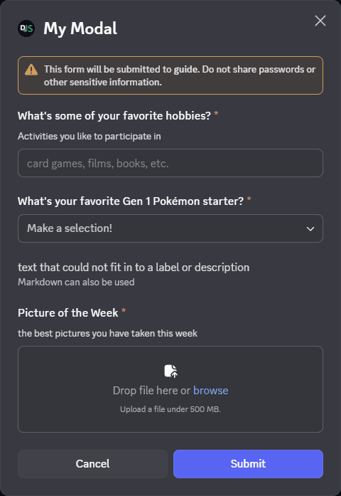
});Restart your bot and invoke the /ping command again. You should see the modal as imaged below:
Receiving modal submissions
Interaction collectors
Modal submissions can be collected within the scope of the interaction that showed it by utilizing an InteractionCollector, or the ChatInputCommandInteraction#awaitModalSubmit promisified method. These both provide instances of the ModalSubmitInteraction class as collected items.
For a detailed guide on receiving message components via collectors, please refer to the collectors guide.
The interactionCreate event
To receive a ModalSubmitInteraction event, attach an Client#interactionCreate event listener to your client and use the BaseInteraction#isModalSubmit type guard to make sure you only receive modals:
client.on(Events.InteractionCreate, (interaction) => {
	if (!interaction.isModalSubmit()) return;
	console.log(interaction);
});
Responding to modal submissions
The ModalSubmitInteraction class provides the same methods as the ChatInputCommandInteraction class. These methods behave equally:
reply()editReply()deferReply()fetchReply()deleteReply()followUp()
If the modal was shown from a ButtonInteraction or StringSelectMenuInteraction, it will also provide these methods, which behave equally:
update()deferUpdate()
client.on(Events.InteractionCreate, async (interaction) => {
	if (!interaction.isModalSubmit()) return;
	if (interaction.customId === 'myModal') {
		await interaction.reply({ content: 'Your submission was received successfully!' });
	}
});
If you're using typescript, you can use the ModalSubmitInteraction#isFromMessage type guard, to make sure the
received interaction was from a MessageComponentInteraction.
Extracting data from modal submissions
You'll most likely need to read the data sent by the user in the modal. You can do this by accessing the ModalSubmitInteraction#fields. From there you can call ModalSubmitFields#getTextInputValue with the custom id of the component to get the value.
client.on(Events.InteractionCreate, (interaction) => {
	if (!interaction.isModalSubmit()) return;
	if (interaction.customId === 'myModal') {
		await interaction.reply({ content: 'Your submission was received successfully!' });

		// Get the data entered by the user
		const hobbies = interaction.fields.getTextInputValue('hobbiesInput');
		const starter = interaction.fields.getStringSelectValues('starter');
		const picture = interaction.fields.getUploadedFiles('picture');

		console.log({ hobbies, starter, picture });
	}
});
when a empty text input is submitted it returns a empty string "". like wise when a select menu is submitted with no
selection made it has a empty array [].